Wednesday, 22 February 2012

Dome


I was looking at some dome ideas for the lobby roof, here are a few. They are all from banks and have quite different features and design. This would be the perfect smash and grab entrance for the robbers in my opinion.


(This image will not rotate, it is the correct way round on my PC, sorry)


This small sky light is actually from the bank that is the inspiration behind the exterior layout soon to be seen in our level.

Here is my sky light for the lobby, and an update on the ceiling as well. I took a lot of inspiration from one dome in particular but still kept it my own with different textures and detailing. This adds a personal and unique aspect to my level so i don't feel like i'm copying too much.


Here is where the robbers have broke in and you can see some equipment left behind. i will add ropes etc. hanging from the gap.


Monday, 20 February 2012

Clock

I was struggling to think what would break up the large wall space i have at the front of the lobby and thought i could add some kind of old architecture, but something they would have purposely kept. E.g. a clock. Here is my progression in designing it.


An early concept of how the clock will be designed and incorporated into the buildings design. This shows it overhanging the main entrance.

To get ideas out of my head and visualise them the fastest way for me is to screen grab the scene and paint over in photoshop. It doesnt look the prettiest but it helps me show myself what i was thinking. 

Just for proof i did this my self and designed my own clock face here are the screens of my progression.


First i mesured out a boarder and center point. I would keep these rulers through out to ensure precision in my placement.


I found a roman numeral font and added the text 1-12 accordingly.


I then divided the circle into 12 thick lines.


From this i could divide the segments into the minute lines, 5 minutes in each.


I masked the center lines so to give the segmented boarder.


I then added some detailing to the center of the face, a black under line to the numbers and a marble texture.


With the addition of several more details like gold trimming and text i had finished the face.


I was basing the exterior of the clock on this window frame.

The angels around the side of the window are semi 2 dimensional. for this i added hints of geometry to effectivly catch the light and shape.

Here is the finished.


Monday, 13 February 2012

Floor design pt.1

 This is my idea for the ground floor... well.. floor. I am going to do the high gloss reflection effect that we did in the group project last year so to get a real marble finish.  Here i am cutting into the BSP and applying each custom texture.

Stone wall

I thought it time to start texturing, just to get some colour in there so i could get a sense of how things were shaping up. Changing the colour in a level really changes the feel of the whole place so getting some base textures in now was essential. I started with my sandstone walls that would go around the top half of the lobby and bring out the warm orange of the level.

First i took my reference images and decided which i would use and which had the cleanest texture quality then using lens correct i fixed the images to a grid. This would ensure that each brick had straight edges and all the corners would be to 90 degrees. 


I then picked out bricks of my choice from the reference images i had collected and straightened.


Next i created a grid and measured in each brick giving them a width of 2 grid paces and a hight of 1, off setting each row to give it a brick wall effect.


Here are the lined up bricks, some are copies mirrored or rotated and certain bricks have brightness variation.


The colour was not the type i was looking for so go get my colour going in the right direction i found a photo that i liked the stone colour of and overlaid it. 


I further tweaked with the colours and levels to get something like this. 
(Other assets are not textured but with have a similar colour palette.) 


Friday, 10 February 2012

PC

Spent the last few days refining my new PC. I'm hoping its an investment in time more than anything so ill make up the lost time within the next week i'm sure. As far as FMP hoes ive just been unwrapping and updating what i already have so nothing worthy of a screenshot. Should start texturing what i have next week and get some colour in there ASAP. Ive also been concepting the joining part of the level between the vault and lobby and ill update when i next post journal entries.

Wednesday, 8 February 2012

Update


Just a little update showing some more wall detailing. I have a full vertical bit of decoration now that stitches together the arches. I have also added a corner piece just to break up the back two corners of the room.

Friday, 3 February 2012

Review


 This shows several screenshots of my work so far. Some of he shots have comparisons to my origional layout mesh, you can see how much its changed. The biggest difference is the scale. It has almost doubled in size. This is due to perspective and other varying factors within max that were completely changed when brought into the UDK. When you have the first person perspective on it you can really tell the true scale required.

This will most likely change as i discover more.


Thursday, 2 February 2012

Wall Update


Just a quick wall update, you can see the trim across the top and bottom of the arches. All have been properly sized and some stand in lights have been added.

Wednesday, 1 February 2012

Walls

At the moment i know what i want on the walls but placing them will determine the final hight of the wall so getting these somewhat blocked out is priority. Then i can hand the outside parameters of my level to Steve and he can begin to construct around it.


  Here you can see an early concept of how i want my walls to be decorated, it shows stone arches that are another story above the working environment, this will give dramatic scale to the lobby.


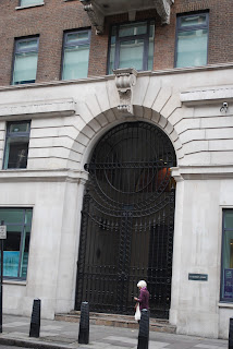
  These references taken from my trip to London show the kind of arches i am thinking about doing. The flat stone with cut in grooves to enhance the detailing. Its a very direct design to the style we are going for and no doubt the same pattern and style will be included outside the bank.

  You see in between these arches are pillars built in to the wall, as more of a detailing. This is another thing i am going to add to my walls.


  Here an image taken from Lloyds in Leicester shows some wall detailed pillars that i wish to include. I also like the addition of the top part where it curves out.


Here you see i have began to model some arches for the walls. Still getting the feeling for this and adjusting it as i go. I have decided to take the curved upper wall detail and make that the part that separates the arches then i wil include the lower pillar under them.


This is just a place holder texture while i scale and plan my walls.